
Introduction: Why Military Logos Matter
A logo is more than just a design; it’s a message. For the U.S. Army, its logo represents history, strength, and national pride. Whether it’s worn on a uniform, printed on recruitment posters, or displayed on military vehicles, the US Army logo speaks for the values and bravery of the people behind it. Since the Army’s founding in 1775, its visual identity has evolved many times. From the early War Office seal to the modern Army star logo, each version tells a story of America’s growth, conflicts, and changing mission.
Understanding the history of the US Army logo helps us see how design, symbolism, and purpose come together. It’s not just about looking official; it’s about standing for something. These changes also reflect modern needs like digital branding, recruitment strategies, and public recognition. In this article, we’ll explore how the Army’s emblem and branding have changed through the years and what they mean today. If you’re curious about Army emblem meaning, symbolism, or logo evolution, this guide breaks it down in a simple and respectful way.
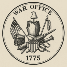
The First Identity: 1775 War Office Seal
The story of the US Army logo begins in 1775, during the American Revolutionary War. Back then, there was no official Army emblem like we see today. Instead, the army used the War Office Seal, which was full of powerful symbols that represented strength, freedom, and readiness for battle.
This early seal showed a Roman-style breastplate, a sword, a drum, and a liberty cap sitting on a spear — each item carefully chosen. The liberty cap stood for freedom from British rule. The drum and weapons signaled military preparedness, while the shield and flag showed national pride. Although it wasn’t a public logo, the seal was used on important documents and communications.
This was the first step in the US Army’s visual identity, setting a foundation for all future versions of the logo. Understanding the Army seal history gives us a better picture of how the Army communicated its values through symbols. Even today, many elements from this design are seen in modern Army emblems, connecting past and present in one meaningful image.
The 1947 Redesign: Department of the Army is Born
After World War II, the U.S. military went through major changes. One big shift happened in 1947, when the War Office officially became the Department of the Army. This was not just a name change it marked a new beginning in how the Army was structured and presented to the public.
With this change, the Army seal was also updated to match the new department name. The design stayed mostly the same, but the words “War Office” were replaced with “Department of the Army.” This helped make the seal more modern and relevant to post-war America.
Another important update was the date on the seal. Originally, it said “MDCCLXXVIII” (1778), but that was changed to “1775,” the year the Army was officially founded during the Revolutionary War. This change helped better reflect the true history and origin of the Army.
This 1947 redesign shows how the US Army logo history is closely tied to American events. Every change has a meaning, showing the Army’s growth while honoring its deep roots.
1974 Emblem Creation: Moving Beyond the Seal
In 1974, the U.S. Army introduced a new design—the Army emblem—to serve as its public-facing symbol. Until then, the Army mostly used its official seal, but that was only meant for legal documents and formal use. There was growing recognition that the Army needed a symbol that was more visible, easier to understand, and could connect with the public in a powerful way.
The difference between the Army emblem and seal lies mainly in usage. The seal is used on government paperwork and internal documents, while the emblem is designed for public communication—such as displays, recruitment materials, websites, and more. Both include the same basic design elements like the Roman cuirass, weapons, and the liberty cap, but the emblem features the wording “Department of the Army” more prominently and is often shown in full color.
The creation of the emblem helped the Army establish a stronger identity in public spaces. This step in Army logo history gave the military a symbol that represented its values, legacy, and mission to both its members and the American people.
The Star Emerges: 2001 Rebranding
In 2001, the U.S. Army made a bold move by introducing the now-famous US Army star logo. This was more than a design update it was a rebranding effort led by the Leo Burnett advertising agency to make the Army more appealing to a younger generation. The goal was to create a symbol that was modern, powerful, and easy to recognize across all platforms, especially for recruitment.
The new logo featured a solid white star outlined in black and gold, placed inside a black rectangle. The black and gold colors weren’t just for style they represented strength and the two key components of gunpowder: charcoal (black) and sulfur (gold). This clever use of color added deep meaning to the design.
This rebranding had a strong impact on recruitment. The new star logo was part of the popular “Army of One” campaign, which helped the Army connect with individuals and highlight personal responsibility and strength. Today, the US Army star logo remains a powerful symbol of the Army’s values and continues to play a key role in public identity and digital branding.
A Modern Refresh: The 2023 Logo Redesign
In 2023, the U.S. Army logo received a fresh, modern update to better connect with today’s audience especially Gen Z. This redesign was led by branding experts at Siegel+Gale and the creative team at DDB, focusing on simplicity, digital appeal, and heritage.
The updated design brought back the classic Army green, a color strongly tied to the military’s legacy. It also introduced a cleaner, bolder typeface that looks sharp on screens, social media, and mobile devices. While the familiar Army star logo remained the core element, the overall style became more minimal and flexible for modern platforms.
The 2023 U.S. Army logo update was more than a cosmetic change it was part of a larger effort to modernize the Army’s image and appeal to younger generations. By blending history with modern branding, the Army created a logo that feels strong, proud, and future-ready.
This redesign helps maintain the Army’s connection to tradition while embracing the digital world, making it easier for new recruits and the public to engage with the brand in a meaningful way.
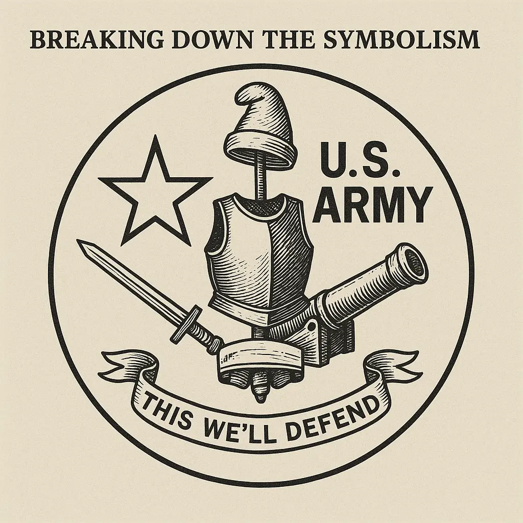
Breaking Down the Symbolism
Every part of the U.S. Army logo has a deeper meaning. These symbols aren’t random they reflect the Army’s history, values, and mission. One of the most powerful elements is the star, which represents excellence, leadership, and guidance. It’s a universal military symbol and the core of the modern US Army star logo.
Older versions of the Army’s seal and emblem feature the liberty cap, also known as the Phrygian cap. This cap has deep revolutionary symbolism, dating back to ancient Rome, where it stood for the freedom of former slaves. In the American context, it became a symbol of liberty and independence during the Revolutionary War. Understanding the Phrygian cap meaning helps us see how the Army honors its fight for freedom.
Other key elements like the Roman cuirass (chest armor) stand for protection and military strength, while weapons like swords and cannons highlight readiness and defense. Even the motto and banners in the emblem speak of courage and tradition.
Together, these features reveal the symbolism in Army logos, showing how each design tells a story that connects past values with today’s mission.
Where and How the Logo is Used
The US Army logo isn’t just a design on paper it’s a vital part of the Army’s identity, seen across many platforms. From uniforms and equipment to military vehicles, recruitment ads, and websites, the logo is everywhere. Whether it’s the classic Army star on a soldier’s chest or a bold visual in a digital campaign, it plays a key role in communication and branding.
In today’s world, the logo’s visibility in modern culture is stronger than ever. It appears on social media, commercials, billboards, and even in movies and video games. This wide usage helps reinforce the Army’s presence and message in the public eye.
There are clear US Army logo usage guidelines that ensure it is always displayed with respect and consistency. These rules cover colors, spacing, size, and placement important for keeping the Army’s image professional and unified across all materials.
Following these guidelines helps protect the integrity of the logo, ensuring it always stands for strength, honor, and trust. It’s not just a mark it’s a powerful symbol of service and sacrifice.
Logo vs Emblem vs Patch vs Insignia
Many people confuse military terms like logo, emblem, patch, and insignia, but each one has a specific role in the U.S. Army’s visual identity. Understanding the difference helps clarify how the Army communicates rank, tradition, and brand across various platforms.
Here’s a simple comparison:
| Term | Use | Purpose |
|---|---|---|
| Logo | Public branding (ads, websites, digital media) | Represents the Army’s identity to the public |
| Emblem | Official public symbol (used in displays, ceremonies) | Formal version of the seal for external use |
| Seal | Legal documents, internal government use | Authenticates official Army business |
| Patch | Worn on uniforms | Identifies unit, role, or branch |
| Insignia | Uniform pins or badges | Shows rank or specialty |
The logo is used for branding, while the emblem adds formality. Patches and insignias are for internal military identity. Competitor sites often overlook this important distinction, but including it helps readers fully understand how the Army presents itself across all formats uniforms, digital platforms, and ceremonial events.
Public Reactions to Redesigns
Every time the U.S. Army updates its logo, it sparks strong reactions both positive and critical. The 2001 rebranding, which introduced the bold Army star logo, was met with excitement from marketing experts but received mixed reviews from veterans and military families. Many appreciated the modern look, while others felt it strayed too far from the Army’s traditional image.
The 2023 U.S. Army logo update brought back Army green and simplified the font, aiming to connect with Gen Z. Younger audiences found it clean and digital-friendly, but some members of the military community missed the classic style. On social media, people expressed both support and concern some praising its sleek design, while others questioned if it truly represented the Army’s long-standing values.
This type of public feedback is a powerful part of logo evolution. It shows that these symbols are deeply emotional and cultural. Unlike many competitors’ content, this section highlights how branding decisions affect real people soldiers, veterans, and citizens. Their opinions matter, and their voices help shape the next chapter of the Army’s visual identity.
Legal Usage & Trademark Rules
The US Army logo, including the star, seal, and emblem, is protected by trademark and federal laws. That means not everyone is allowed to use it freely, especially for commercial purposes. If you’re a civilian or business owner wondering if you can put the Army logo on clothing, merchandise, or digital products the short answer is no, not without permission.
The Department of the Army has strict branding guidelines that outline how and when the logo can be used. It’s mainly reserved for official military use, approved partners, and licensed vendors. Unauthorized use may lead to legal action, especially if the logo is used in a way that suggests endorsement by the Army.
Even veterans and military families need to follow these rules if they’re planning to use the logo on custom gear or public materials. The reason for this strict control is to protect the integrity, respect, and identity of the Army brand.
If you want to use the logo legally, it’s best to check the US Army logo usage guidelines or contact the Army Trademark Licensing Office before moving forward.
Final Thoughts: The Legacy and Power of the US Army Logo
The US Army logo stands as a bold symbol of strength, honor, and American heritage. From the first War Office Seal in 1775 to the striking US Army star logo and the modern 2023 U.S. Army logo update, each design reflects the Army’s evolving mission and deep connection to its roots. Blending historic symbolism like the Phrygian cap, star, and Roman armor with modern branding, the logo builds trust, pride, and recognition.
Whether used in recruitment, digital media, or official uniforms, the logo carries strict Army branding guidelines and trademark protection, ensuring it’s used with respect. Its evolution showcases how the Army stays true to its values while adapting to future generations.
In short, the US Army logo’s history tells a powerful story one that honors the past, supports the present, and inspires the future.
FAQs
1. When was the original US Army logo created?
The original US Army seal dates back to 1775, during the American Revolutionary War. It was designed to represent the War Office and later evolved as the Army modernized over time.
2. What does the star in the US Army logo symbolize?
The star in the US Army logo stands for excellence, leadership, and service. It’s a widely recognized military symbol used to inspire trust and confidence in the Army brand.
3. How has the US Army logo changed over the years?
The US Army logo has changed multiple times most notably in 1947, 1974, 2001, and 2023 to reflect new missions, modern branding needs, and to appeal to younger generations while honoring its history.
More Information: Click Here